Step up your custom t-shirt game with this super quick and easy Silhouette Studio design trick to adding a cool shadow effect to any text design!
You can use this trick in any version of Silhouette Studio and it's perfect for beginners who are looking to start adding more elements to their designs.
You use any of your favorite fonts for this part. If you're in need of some new fabulous fonts (and who isn't?!), take a look at the Big Trendy Fonts Bundle at So Fontsy. This bundle includes 27 commercial free, super popular and bestselling fonts that you can use to create on-trend t-shirts and so many other projects!
Once you have the word typed out select the word and click the Weld button in the top quick access menu.
Group everything then resize the word to the desired size for your shirt or project.
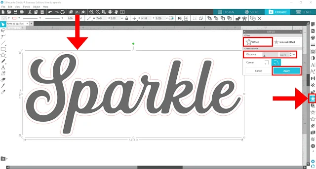
Select the word or phrase, open the Offset panel, and add an offset. This offset will be your shadow, so the bigger you make the offset, the bigger the shadow will be in your final design. An offset of 0.075 inches worked well for this project. Click Apply.
Next - VERY important - if the offset isn't one element (i.e. there are multiple pieces that aren't all connected together), you MUST group all the elements of the offset together. However, make sure you don't group the offset and the original word together.
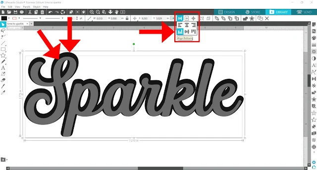
Select the offset and the original word and hover your cursor over the alignment tools button in the top quick access menu. This then, opens a drop-down menu with different alignment options.
Next, select the Align Bottom or Align Top option. This will slightly adjust the positioning of the offset so that it isn't perfectly centered around the original (and which makes it look more like a shadow).
Close-up of Align Bottom option.
You can then make further adjustments to the position of the offset (aka shadow) by next selecting both elements again, and this time selecting either the Align Left or Align Right option.
Play around with the positioning of the shadow until you're happy with how it looks. Here's what the shadow looks like with the Align Right option - the shadow looks like it's cast off to the left and it's the original word that is aligned on the right of the offset. Remember to always select both the shadow and the original word before selecting an align option.
and weed out the excess. Tack down the bottom (offset/shadow) layer first with a quick 1-3 second press.
Then, remove the carrier sheet.
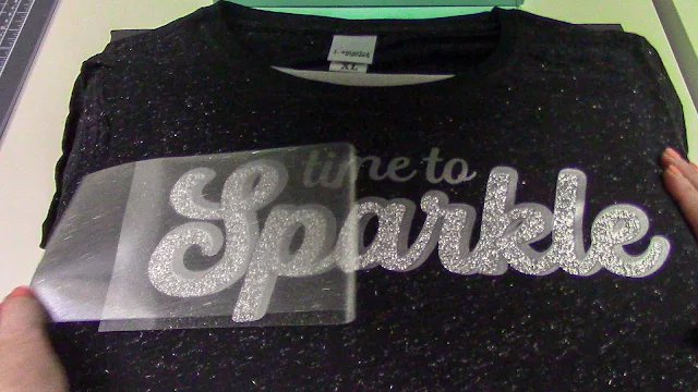
Next, position the top layer over top with the same alignment to the bottom shadow layer as the one you created in Silhouette Studio. It can be helpful to have the design open in the software for reference.
Then, press HTV for the full amount of time and remove the carrier sheet.
And wow- you're done! Use this easy trick to customize any text-based design or, even better, create your own using your favorite font! Want the font used in this project? Grab it from the Big Trendy Fonts Bundle over at So Fontsy.
Get Silhouette School lessons delivered to your email inbox! Select Once Daily or Weekly.


.png)


What kind of vinyl are you using for the layers?
ReplyDelete