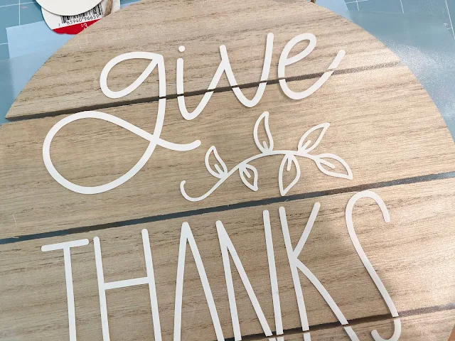
A lot of wood signs have wood slats which means there's a space between each board where the vinyl basically bridges between the boards. BUT did you know you can design a break in your vinyl design so the vinyl isn't stretched across. It's actually pretty easy.
Start by taking a picture of your wood sign. I found this one in Target's Dollar Spot. It's a 10" round board with 4 piece of wood and therefore three spaces.
Open the photo of the wood sign in Silhouette Studio. You can drag and drop the photo into a work space or go to File > Open and navigate to the jpeg. The photo probably came in pretty big so you can resize it so it's more manageable for now, but we're going to re-size again in a step or two.
If you haven't already done so, measure your sign. You want the EXACT dimensions. This one's easy as it's an even 10".
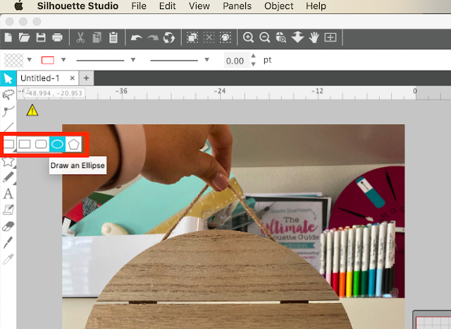
From the left sidebar, use the Draw an Ellipse tool (if you're working on a round sign) or the Draw a Rectangle tool for a square or rectangle sign to draw out the shape of the board using your mouse.
Select the shape and enter the exact dimensions either into the Transform panel or the Quick Access Toolbar.
Once you have your shape the EXACT size of the actual board, take your photo and resize it so the sign (not the image itself) matches the size of the shape you drew. To do so, select the image and grab one of the corner nodules and pull in or out to scale the image proportionally.
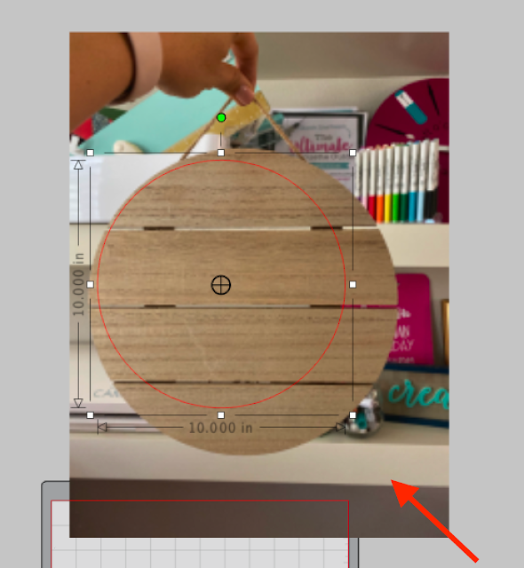
Do not resize either the shape or the image from here on out!
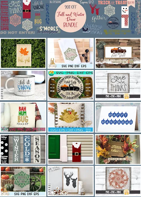
Open the design you are going to put on your shape. You can open it in the same work area by dragging and dropping in or by going to File > Merge and navigating to the file. I am using this Give Thanks design which is one of the 36 cut files that's included in So Fontsy's Fall and Winter Decor design bundle available for a limited time.
If your design is not filled with a color, I recommend filling it to match the color vinyl you are going to use using the Fill Color tool.
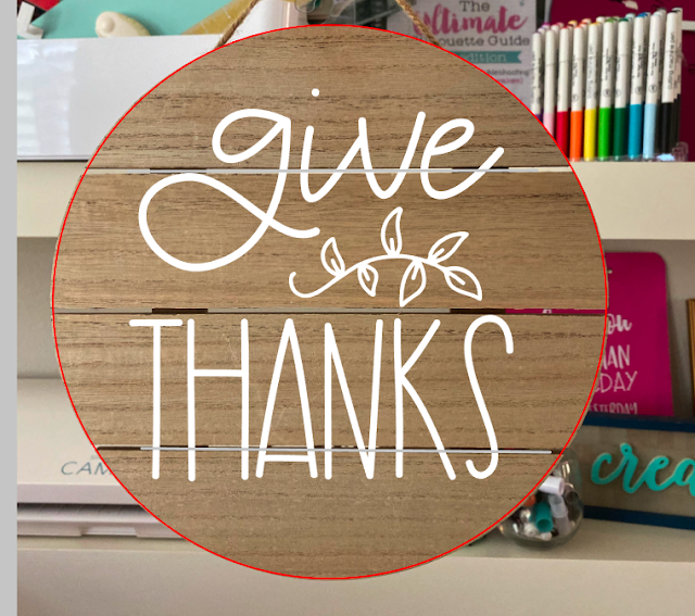
Size the design so it fits on your board. If possible, position your design so as little of the actual design is covering the slats. For example, I moved my design up a tad so the laurels were fully on the middle board and did not cross between two.
Now from the left sidebar click the Knife tool. Uncheck the Auto Apply option from the Quick Access Tool Bar.
Hold down Shift and use your mouse to draw a straight line between two of the boards. Before you click Apply, you can actually increase the thickness of the knife line to make a bigger slice - if needed.
To do so, select the knife line you just drew and open the Line Style tool from the right sidebar. Increase the line weight.
Duplicate the knife slice for as many slats as you have in you board and move them into position. Select all of the knife lines at the same time by holding down Shift and clicking on them. Then from the Quick Access Tool Bar, click Apply.
You've just created breaks in your vinyl design that will match up with the slats in your wood sign.
You can now remove the image of your board from Studio if you'd like.
Select all pieces of your cut file > right click > group. Move them onto your virtual mat and then proceed with cutting the vinyl.
Cut and weed the vinyl.
Use transfer tape to move the vinyl to the wood board being careful to line the breaks up in the design with the slats on the board.
Remove the transfer tape at a diagonal.
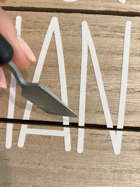
If the vinyl is hanging over the boards a little bit (because your knife slice wasn't quick thick enough) just use your scraper or spatula to fold and press it down.
Designing this way prevents you from needing to use an xacto knife to the vinyl after you've applied it.
Don't forget to grab the Fall and Winter Decor design bundle...the 36 commercial and personal use deal for $8.99 expires December 2!
Note: This post may contain affiliate links. By clicking on them and purchasing products through my links, I receive a small commission. That's what helps fund Silhouette School so I can keep buying new Silhouette-related products to show you how to get the most out of your machine!
Get Silhouette School lessons delivered to your email inbox! Select Once Daily or Weekly.











.png)


Trying to figure out what I search to leanr to create a design on an odd shape, ie stocking, that fits the space perfectly to be used as a stencil. Any ideas?
ReplyDelete