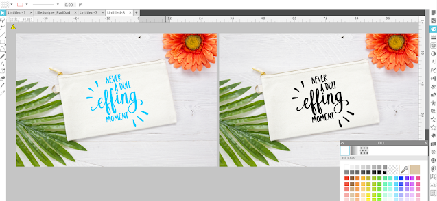
Mock Up photos help sell physical goods and digital designs by letting potential customers 'see' the finished product without you actually creating it first. Put it to you this way...which of the above sets do you think sells more?
Craft mock ups are a huge help in selling digital products as well allowing designers to show examples of how their cut files can be used. These five tips will help you take your mock up game to the next level so you can sell more - and at a higher price!
Before we even into how to create mock ups in Silhouette Studio - a warning. Always make sure you have mastered how to make the actual product you're selling. It's great if you can make that custom shirt made with HTV look good on a mock up, but if the HTV is peeling off the finished product because you haven't yet mastered heat transfer vinyl...that's false advertising and the quickest way to kill your Silhouette business.
1. High Quality Mock Up Photos
The best way to start making attractive craft mock ups in Silhouette Studio is to start with high quality styled mock up photos like those in the Mock Up Section of So Fontsy. There are some very talented photographers who have caught on to this trending in crafting and are now offering high resolution and beautiful craft mock ups with the commercial use license.
If you want to try your hand at photographing your own mock up photos, check out these tips for crafters for styling mock up photos
Once downloaded, imported and opened in Silhouette Studio (just drag and drop the jpeg file into a work area from your desktop) these craft mock up photos appear extremely large - that's due to their high resolution.
In additional many mock up photographers have started offering styled photos of some of the most popular craft blanks small Silhouette business sellers use to sell in their shops such as Bella and Canvas shirts, stainless steel tumblers, wine glasses, and more.
On So Fontsy, many of the craft mock up photo shops are including a link or note on the actual item photographed. This way Silhouette crafters can match the mock up photo to the exact physical item they are selling.
2. Use Neutral Colors with a Slight Transparency
Craft mock ups are made by simply overlaying a filled design (with a transparent line color) over the jpeg photo.
The idea is to fill (using the Silhouette Studio Fill Color tool) the design with the same color material (vinyl, HTV, paper, etc) you will use on the actual product.
While bright colors may look cute on a finished physical product, in photos they just don't work too well and can actually turn off a customer. It's better to stick to neutral colors like black, gray and white as they look more realistic in photos rather than using reds, blues, and greens.
To keep craft mock ups created in Silhouette Studio colors looking as 'real' as possible, always pull down the transparency slightly. From the Fill panel accessed on the right sidebar, move the transparency to between 8-15%. This just make the color of the filled design not so stark and a lot more realistic.
Remember the goal is for your customers to not even realize your product photos are mock ups!
3. Don't Hide the Design!
Make the design the center of the photos so it's easily visible even if it means cropping the photo in Silhouette Studio. A lot of photographers will give you extra 'head room' or background area so you have some flexibility with your mock up photos. While the styled photo is nice - you are selling the design or the finished product and not the background, right?Here's a great example. This is a beautiful mock up photo of a beach or pool bag. But it's almost difficult to read the design because it's so small compared to the overall size of the photo. As a thumbnail image in an online shop or product listing it would be even smaller.
But using this quick trick to easily crop photos in Silhouette Studio you can put the focus on the design or the product itself.
4. Show Variety With your Craft Mock Up Photos
Showing variety is important whether you are selling SVG designs for Silhouette or Cricut or selling the finished physical good.
Let's say you have a small Silhouette business owner whose niche is wood signs, but you never show your designs on signs.
5. Avoid Screen Grabbing and Export in a High DPI
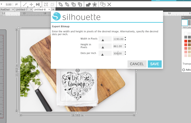
If you're using mock ups to share with customers or list in your shop, avoid screen grabbing from Silhouette Studio. Making the one time investment for Silhouette Studio Business Edition - so you have the ability to export as a JPEG is worth every penny it will set you back.
When you export mock up photos from Silhouette Studio select the photo and the design at the same time then go to File > Save Selection > Save as JPEG. In the box that pops up change the Dots Per Inch or DPI to at least 300. If your custom DPI won't stick, scale down the mock up then try to re-export at 300 DPI.
Exporting this way will give you a high quality, realistic looking craft mock up photo that you can use to show off the beautiful work you sell in your shop!
All of the mock up photos used as examples in this Silhouette mock up tutorial are part of the Mini Summer Mock Up bundle which is available for a limited time exclusively on So Fontsy.
Note: This post may contain affiliate links. By clicking on them and purchasing products through my links, I receive a small commission. That's what helps fund Silhouette School so I can keep buying new Silhouette-related products to show you how to get the most out of your machine!
Get Silhouette School lessons delivered to your email inbox! Select Once Daily or Weekly.


.png)


Wonderful tutorials, I really appreciate your article, Thanks for sharing with us.
ReplyDeleteI always try to save at a DPI of 300 if possible.
DeleteNice tutorial. This tutorial is very useful and informative for us. Thanks for sharing this good post.
ReplyDelete