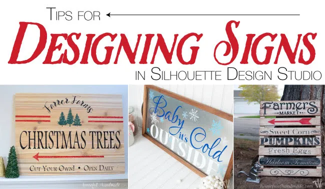
 Silhouette School monthly contributor Kati from Houseful of Handmade is here today with some tips on creating designs for wood signs!
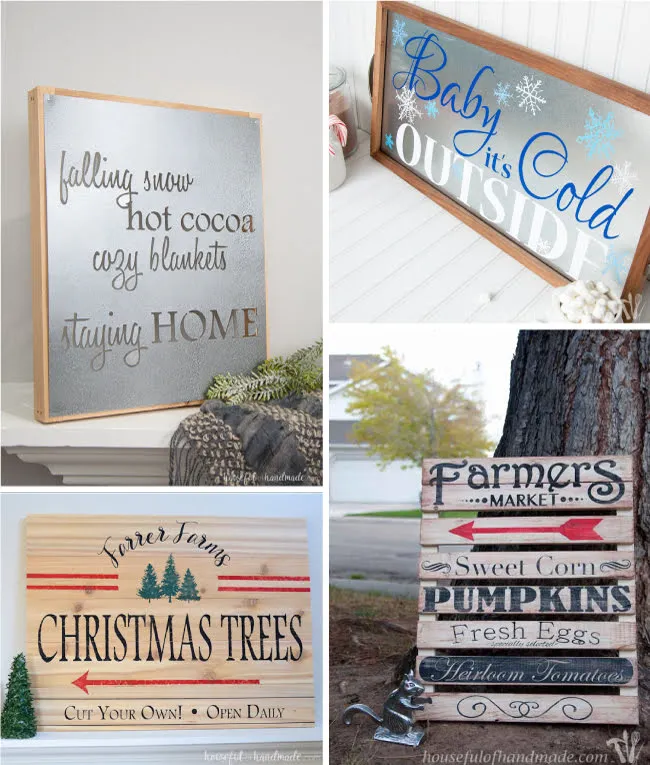
I bought my Silhouette Cameo so I could create my own unique and fun signs too. But sometimes you have wonderful ideas, but when you start designing your signs they just fall flat. How do you create the stunning signs you want? Here are some tips to get you started designing beautiful signs with your Silhouette.
Setting Up Your Silhouette Studio Workspace
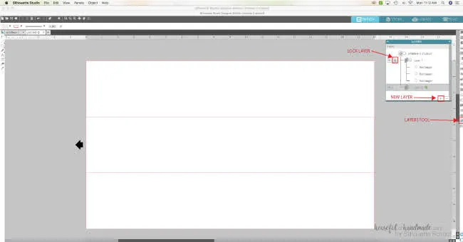
When designing a sign, I like to set my workspace up in Silhouette Studio to mimic the final sign. That makes it easier for me to visualize all the parts of the design we are going to look at below. For this Silhouette tutorial we will pretend we are designing a sign for the DIY Framed Shiplap Sign blank I showed you how to build here. So I set my Page Size to Custom and changed the width to 18" and the height to 10 ½".
Also, when working with a sign that has seams like this one, I like to mark where the boards are so I can make sure my design does not cross the seams at a bad spot (like the bottom 1/4" of lettering or in the middle). For this design I created 3 18" x 3 1/2" rectangles using the Draw a Rectangle Tool to mimic the boards in the sign.
Then using the Layers function in Silhouette Studio Designer Edition, you can lock the rectangles so they do not interfere with the design above. Press the Green Plus to create a second Layer and then click the Box next to the Eye (it should be empty) to Lock the Layer that has all your rectangles on it. Now make sure Layer 2 is highlighted when you start designing so you are designing on the unlocked layer.
Pairing Fonts
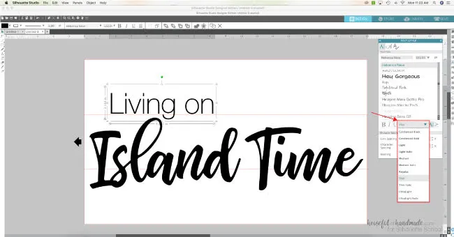
Mixing fonts is the best way to add some interest to your sign design. I always recommend sticking with 2 fonts per sign design to keep things cohesive and easily readable. But if you feel your design needs more fonts, try using an alternative of one font like all caps or small caps. Or see if the font has different weight options by clicking the Down Arrow next to the Underline feature in the Text Style Panel.
When mixing fonts, pair a fancier font (script fonts, serif fonts, hand drawn fonts) with a simpler font to keep things from looking too busy. I use a lot of trial and error to find things that work.
Sign designing is not quick, but fun! Play around with pairing some of your favorite fonts together see what you like. If you are struggling with finding two fonts you like together, there are some beautifully matched Font Duos available at SoFontsy so you do not have to think about it.
Letter Spacing
Did you know you can change your letter spacing and kerning (a fancy word for adjusting the space between the letters) in Silhouette Design Studio? Use the Character Space Slider to make the letter closer together or further apart.
The Kerning option is great for words that may leave extra space between certain letters (like the diagonal letters in wave). When you press the Kerning button you can toggle between the original Kerning and spacing those diagonal letters closer together so they look more natural.
Creating Contrast
Contrast in any design makes it more interesting. There are many ways to create contrast in a sign here are just a few.
- Using a thick bolder font and a thin dainty font creates contrast.
- Making part of the design inverted so the words or art is the negative space with a box around it creates contrast.
- Adding a pop of bold color contrasting the white or black design.
White Space
White space is an important part of design. White space does not need to be white, it refers to the empty space around a design. Not just the outer area, but the space between elements and even the space between each letter. White space is important because it allows the eye to move around the design in and allows the elements to breathe.
Here is a quick example of the impact of white space in my Christmas Tree Farms design. The first design has room around the different elements so the eye can flow between things. Also, the main part of the design is the larger part so that is where your eye starts (and is suppose to). The second design is the exact same elements but without white space. There is no clear focal point of the design and your eye keeps bouncing around because it cannot stop and breathe.
Note: This post may contain affiliate links. By clicking on them and purchasing products through my links, I receive a small commission. That's what helps fund Silhouette School so I can keep buying new Silhouette-related products to show you how to get the most out of your machine!
Get Silhouette School lessons delivered to your email inbox! Select Once Daily or Weekly.







.png)


No comments
Thanks for leaving a comment! We get several hundred comments a day. While we appreciate every single one of them it's nearly impossible to respond back to all of them, all the time. So... if you could help me by treating these comments like a forum where readers help readers.
In addition, don't forget to look for specific answers by using the Search Box on the blog. If you're still not having any luck, feel free to email me with your question.