He wasn't convinced by my argument so I had to 'show' him what it would look like and then...I got my way. Thank you, Silhouette Studio.
By the way - I can tell you no one mocks up a room faster than a wife on a mission to convince her husband she 'needs' to make a home decorating change. In other words this won't take you long.
After I shared the before and after photo on Facebook, I got a lot of you asking me how you, too, could convince your husbands that you 'needed' to change up the decor or just help you see the vision come to life before you actually commit.
This project actually started weeks before the accent wall idea even came to me....and it started in Silhouette Studio where I almost always make interior decorating mood boards.
I am gonna warn ya now...I'm gonna ramble more than I usually do in this post... so grab a cup of coffee.
I love using Silhouette Studio this way so I thought I'd share a few tips for how you can use the design program for home decorating mock ups. This type of thing calls on using a lot of "tricks" and combining a lot of different features and tools in Studio - like Image Effects, Trace and Detach, and even Magnet Trace. Throughout, I will link to Silhouette tutorials where appropriate in case you need further explanation.
To start, take a picture of your space. I was mid-way through converting a living room space into more of a kid-friendly 'lounge'.
Import the photo into Silhouette Studio just like you would any other design: File > Open navigate to the jpeg and "Open."
This is my original photo.
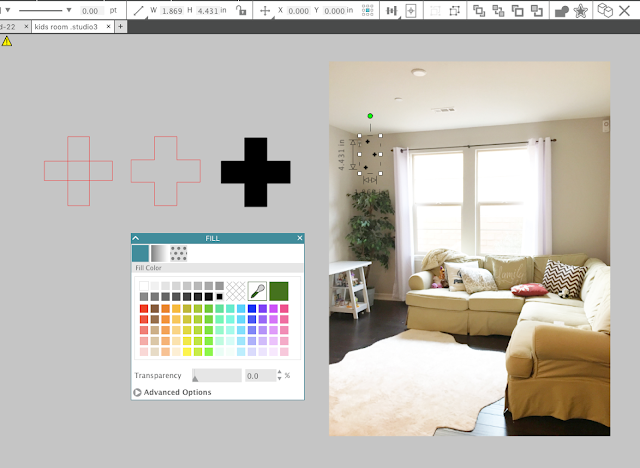
The first thing I did was add the vinyl decals to the wall. So take the shape you plan to use and fill it with a solid color using the Fill Color tool and also change the line color to the same color. Size the design so it's pretty much in proportion.

Now overlay it over the photo. I laid out the decals how I generally planned to put them on the wall and then quickly made copies. Use your favorite method to replicate in Silhouette Studio. Pay attention to the details (like not putting any decals over the plant) to make it look the most realistic.
The next thing I did was add the light fixture. I was waiting to install this fixture (which I did myself....scary!) but at the time it was still in the box. I went back to the website where I ordered the fixture and quickly took a screen grab of the listing photo. I then brought the photo into Silhouette Studio. You can bring it into the same work area by doing File > Merge or you can open in a new work area with File > Open.
Putting the light up with a big white box around it isn't very realistic. The easiest way to remove the background is with a Trace and Detach.
Trace the image and then use the Threshold bar to fill it in completely with yellow.
When you click Trace and Detach it will look like nothing happened...but you'll be able to pull away the background.
Move the image over your main picture and scale it. Again, it's those details like proper scale/size that will make the mock up look the most realistic.
I repeated the same process of Trace and Detach for the leather pouf (and then made a copy since I wanted to put two in my room).
The final big change was the color of the couch. At the time, we were planning to sell this sectional and move a gray sectional from another room into this room.....so I had to make this couch gray. Enter Magnet Trace and Image Effects.
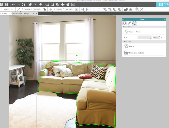
Magnet trace allows you to manually drop a cut line around part of an image while the software magnetizes to the edge of the object. The tool itself is still rough - but it works well enough for this purpose.
Make a copy of your background image and work on the magnet trace on that one. In the Magnet Trace panel (within the Trace Panel) start clicking around your image. This will produce a green line. When you get back to the end, the shape will close.

You can then click on the line you created and add extra edit points, fine tune, or move points to get a more accurate shape.
Once you're satisfied click "Trace and Detach." (If you just click "Trace" you will get just a cut line in the shape of the couch, rather than the couch itself.) Click on the couch and drag it away from the background.
Almost there....
In this case, I wanted a gray couch rather than tan which is where Image Effects (previously called Shader Effects in V3) comes in. Open the Image Effects panel and adjust the color of the couch so it's more in line with what you're going for. I was able to just use the Gray Shade option.
Now simply overlay the couch onto the mock up photo...placing it right over the original couch.
If anything is 'hidden' you will need to adjust the order. For example, the couch layer is blocking one of the poufs so I need to select the pouf > right click > Bring to Front.
I now have a pretty realistic looking mock up. And one convincing enough that my vision was enough to convince him ;)
Just dig into those bag of tricks and then show him a side by side and you'll be well on your way to adding vinyl decals all over your new accent wall.
Here's the actual room now....the only thing left to do is get some art for the wall and I'm still trying to figure out the perfect piece. Of course I've been mocking it up in Studio before I commit.
Inevitably, with these kinds of posts, I get questions about where I purchased this or that...so I'm just gonna make this easy on all of us and share links to where everything was purchased.
Black Oracal 631 for the wall decals
White Double Trestle Ladder Desks (2)
Set of 2 Ghost chairs (I spray painted the legs gold to match the light)
Area Rug (Overstock)
Sputnick Style Light Fixture
Set of 2 Leather Poufs
Black Cave Chair from PB Teen
Pillows (Target, Amazon, Home Goods)
Note: This post may contain affiliate links. By clicking on them and purchasing products through my links, I receive a small commission. That's what helps fund Silhouette School so I can keep buying new Silhouette-related products to show you how to get the most out of your machine!
Get Silhouette School lessons delivered to your email inbox! Select Once Daily or Weekly.


.png)


Very clever! Fantastic way to include pre-owned furniture into new spaces. Thank you for sharing!
ReplyDeleteThank you soooooo much for posting this. I never played with trace and detach before, this is going to be my new favorite thing now :) So much easier than photoshop!
ReplyDeleteSuch a great idea!Thanks for sharing!
ReplyDeleteThe first thing I would have thought of for the blank wall was a world map in black (Vinyl of Course ;-) - what else)
That is really cool! Thank you for this idea. Can't wait to try.
ReplyDeleteI love this idea! I've been pondering and puzzling over how to redecorate my kitchen, including cabinets, countertops and flooring. I'm going to use Silhouette Studio to try out some colors.
ReplyDeleteThis was so much fun to read and watch. Keep having fun. :)
ReplyDeleteHi Melissa,
ReplyDeleteI purchased one of your ebooks, and I'm deciding on a second one. Is this tutorial included in one of your guides? I am very interested in mock ups.
Thanks.
Brenda Lee