So what is Kerning anyway? Good question. I'm not even going to lie and try to act like this is a super interesting topic...but it is one that I get asked about from time to time, in regards to Silhouette Studio, so I figured I'd share.
Kerning is the spacing between certain characters of certain fonts in certain situations. Real specific, I know.
Let's see if we can get to the bottom of this.
Sometimes you'll click on the kerning tool, found at the bottom of the Text Style window, and nothing will happen. Other times you'll notice some of the characters slightly adjust. That's the way kerning is supposed to work. The biggest changes will be found when kerning is applied to words that include letters that are wide or have overhanging serifs.
Lets' look at a few examples. Keep in mind, kerning is 'off' by default in Silhouette Studio.
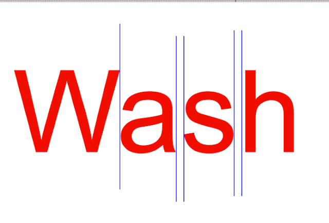
When I type out the word "Wash" in Silhouette Studio, it may not look like there's any type of spacing issues.
But if you take a closer look, there's actually no space between the 'W' and 'a'. That's caused by the wide and overhanging W.
 Now if I make a copy of the same text and, with it selected, turn kerning on...the 'W' and 'a' move slightly apart.
This doesn't mean that every time you have a 'W' and 'a' next to each other this is going to happen when kerning is turned on. It means that with this font it it will adjust when kerning is applied.
Here are few more examples using the most common letters and letter combinations that impact kerning.
The words in red have kerning turned off. The words in black are the exact same size and font style, but with the kerning turned on. At a quick glance (or untrained eye) they look almost identical.
When I overlap the two lists, it's easy to see that some of the spacing of the words were adjusted when kerning was turned on, but not all.
Now let's go one step further and change the font style, but keep the words and letter combinations exactly the same.
You'll notice that some spacing adjustments were made when kerning was turned on.
BUT the adjustments were NOT always the same as those that were made when kerning was turned on for the same letter combinations - but in a different font.
So the bottom line is - certain character combinations - such as TA or P. or Va - will trigger kerning more often than other character combinations because of the width of certain letters or the serif and some fonts will be more impacted by kerning than others.
Note: This post may contain affiliate links. By clicking on them and purchasing products through my links, I receive a small commission. That's what helps fund Silhouette School so I can keep buying new Silhouette-related products to show you how to get the most out of your machine!
Get Silhouette School lessons delivered to your email inbox! Select Once Daily or Weekly.


.png)


So do you recommend turning on Kerning or not? Thank you Melissa.Jerri
ReplyDeleteI will turn it on and off and look at the letter spacing. I keep whatever is closest to what I want. I always separate and kern manually at the end.
Delete