The distressed look is so hot right now, with everyone wearing vintage tees and old school style. While I know there are distressed fonts available, sometimes I want a font I already have OR maybe I want to distress an image.
Let's take a look at how that is done in Silhouette Studio! First, go to your favorite image search, such as Google Images. Search for something similar to "black and white distressed background".
Also remember that some of these images are copyrighted, so you may want to look for royalty-free images. Here is the one I chose from FreePik.com. Be sure to read the individual licensing if you are not familiar with FreePik.
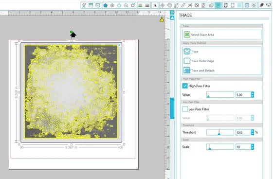
Next, go ahead and copy/paste or import your distressed clipart into Silhouette Studio and trace it. This will convert the clipart into a cut file so that we can manipulate it with our fonts or shapes. Getting a "perfect" trace isn't important, so just do the best you can....and remember, it may take a while to process the trace as you're asking the software to generate a whole lot of cut lines!
Now set up the text or shape that you want to distress. I'll use both in this example so you can see that it will have the same effect.
Here is the cut file design that I want to distress, as well as the traced image of the distressed background. They don't look like much just yet.
Here is the cut file design that I want to distress, as well as the traced image of the distressed background. They don't look like much just yet.
If you fill both the design and the distressed area with a solid color, you get a better idea of what the distressing will look like.
Make sure the distressed image is 'in front' or on top of the other design. You can bring it to front by selecting the distressed image > right click > bring to front.
Make sure the distressed image is 'in front' or on top of the other design. You can bring it to front by selecting the distressed image > right click > bring to front.
Once you're set on your distressed look, open your MODIFY window.
With both items selected (AND the distressed image in FRONT ), select SUBTRACT in the Modify window. And again - be patient! You are again asking the software to work really hard...remember reach of those little distressed areas is a cut line.
This neat little trick will work for any font or shape you can dream up! If you need the run down on how to cut and weed distressed fonts and designs check out this Silhouette School tutorial for Melissa's best tips and tricks!
Get Silhouette School lessons delivered to your email inbox! Select Once Daily or Weekly.


.png)


That's a great tutorial. Do you have any suggestions on how to weed all of the vinyl to make the transfer process any easier?
ReplyDeleteI take a piece of transfer film from a recent project and keep touching it to the image...it doesn't get them all but it will get a lot of the really tiny ones
DeleteThat looks awesome! The thought of weeding that though makes me cringe. Any tips??
ReplyDeleteGreat tutorial! I think it will look fantastic with Halloween images!
ReplyDeleteWhen I hit Subract - most of my image goes away. what am I doing wrong????
ReplyDeleteHey there! It sounds like you may not have both items selected. With both items selected (AND the distressed image in FRONT ), select SUBTRACT in the Modify window.
Delete