Many times I work through Silhouette School tutorials just to show the process rather than the finished product. Other times I am sharing a free cut file and I need to quickly offer an example of how it can be used. Sometimes it's most effective to make a mockup and not the actual item. If you're seller, this is especially useful to show customers an example of what their idea will look like before it's actually made. You can also use mock ups as listing photos.
The key to effective mockups is starting with a great stock photo. For blogging purposes I take my own stock photos of things like kids in white shirts, blank pillows, and empty picture frames. What you take pictures of will depend on what you're selling or sharing with customers. Just remember, with a blank slate, you can use the same 'stock' photos over and over again for mockups. Also remember, you need to be taking your own photos to be using them commercially which is what you're doing if you're selling.
Let's take this photo of a blank burlap pillow I took on a chair in my home awhile back. For photos you are going to use a lot for mockups, it's best to save them in your Silhouette Studio Library.
First, snap a picture with your camera or phone and download it onto your computer's desktop.
Then open up Silhouette Studio and go to your library.
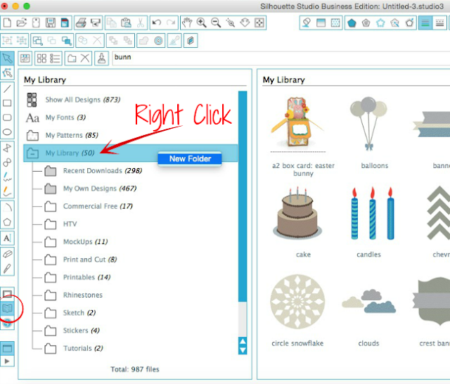
Right click on the "My Library" folder and select "New Folder." Name the folder "Mockups."

Click on the Mockups folder to open it. Find the photo (or photos) you saved on your desktop and drag and drop it into the Mockups folder. (All the designs you see on my mockup files are overlays - they are NOT on the actual photos.)
Now when I need to share a design that could go on a pillow (or if I am showing a customer what their idea for a design would look like on a pillow) I go to the Mockups folder of my Silhouette Studio library and open it.
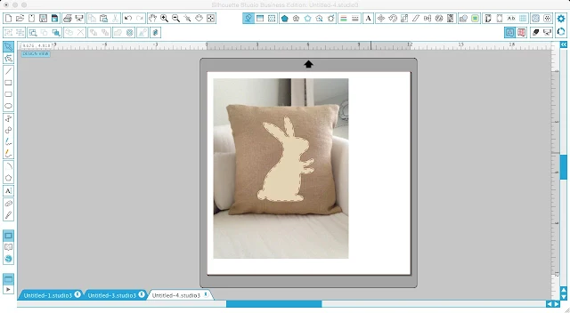
Then I simply open the design from my library and size it to fit on the pillow. If necessary, you may want need to slightly adjust the angle of the design by using the green circle on top of the design's selection box.
Also, use the Fill Tool to fill the design with the color vinyl or paper you will be cutting on and change the line color to 'transparent' to get rid of those red lines.
Want to offer options...just make a duplicate with a second option. You can select the design and change the fill color, the sizing, the orientation..whatever the options might be!
Then I simply take a screen shot of Silhouette Studio using the 'Grab' tool on a MAC or "Print Screen" function on a PC. That's what I show my customer, use as my Etsy listing photo, or share on the blog or social media.
Here are a few more photos I keep handy for Silhouette mockups...
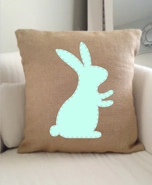
And here they are with designs overlaid.
See how awesome it is? You save yourself a whole lot of time and materials by just taking a few pictures of 'blanks' to use for Silhouette mock ups!
Note: This post may contain affiliate links. By clicking on them and purchasing products through my links, I receive a small commission. That's what helps fund Silhouette School so I can keep buying new Silhouette-related products to show you how to get the most out of your machine!
Thanks for coming to class today at Silhouette School. If you like what you see, I'd love for you to pin it!

Get Silhouette School lessons delivered to your email inbox! Select Once Daily or Weekly.


.png)


Great article, though it is not necessary to take your own photographs for commercial advertising because there are plenty of free Mock up files available for commercial use that are professionally taken and have all the shadow layers etc to give a really professional finish, google is your friend.
ReplyDeletewhere do you find the free commercial ones? I've been searching!
DeleteAgreed, I would like to know as well. I've tried to google and haven't found any.
DeleteThanks for another great lesson!
ReplyDeleteThis is amazing--I have spent hours tweaking my mockup process and didn't know you could do so much right in Studio! Saved a ton of time. But...my Snipping Tool exported the finished image at <300 px. Does anyone know how to get a higher res PNG snipped from Studio?
ReplyDeleteThanks for the great tip, it's going to be very useful soon 😊
ReplyDeleteThanks for the great tip, it's going to be very useful soon 😊
ReplyDeleteThis comment has been removed by the author.
ReplyDeleteCan you curve your text/design if the object you are mocking up is curved (e.g. a mug)?
ReplyDeleteYou shared a tutorial which help to Creating MockUps in Silhouette Studio with Your Own Stock Photos. People who have idea of using Silhouette mockups then it's easy to creat very good looking pictures according to desire. However, I'm trying to find assignment master uk but its good for me that i got this wonderful post.
ReplyDeleteThis comment has been removed by the author.
ReplyDeleteHow do you show glitter on a mock up?
ReplyDeleteI read your tutorial. I have figured out how to do the screenshot and then I paste into Paint. I then save and upload to pizap where I crop it and it looks so grainy when I upload to Etsy. I cannot for the life of me figure out how to crop it so the photo is clear.
ReplyDeleteIt's probably becoming grainy b/c of the screengrab and then opening in another program. If you are using them for Etsy product listings, I would highly suggest getting Business Edition so you can do everything in Silhouette Studio and save out directly from there as a JPEG. You will get a higher resolution/quality image.
DeleteStill one of my favorite tips. I'm designing decals for my new car, so I brought in a JPG of the rear window to help me determine size, placement, and even if the patterned vinyl I want to use will show up without layering on offset color.
ReplyDelete