Here's the kicker...in order to turn any font into a chalkboard font you will need Silhouette Studio Designer Edition. That's the one-time software upgrade that will set you back about $26 but will totally change your Silhouette-life.
To start, begin typing out your text. I highly recommend you give each word its own text box rather than typing everything in one box. This simply makes editing and manipulation easier.
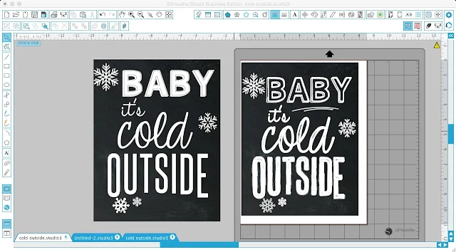
Size the text, find the font styles you like from the font style list, and move the text boxes/words around until you get the design just how you like it. If you're going for the chalkboard look, nothing screams FAKE like having a chalkboard background with some nice crisp letters...yeah, not gonna work. Doesn't the right example look so much more chalkboard-ish?! Yeah, I thought so....
Sure you can purchase or download one of the chalkboard style fonts online, but sometimes they're just not fitting the bill. That's when you make your own chalkboard style font in Silhouette Studio.
A few things before you start:
- Where necessary, make sure text is welded (indicated in this example by the arrow). Select text > right click > weld.
- Turn the Fill Color to 'transparent' (Circled and checked in green above)
- Change the Line Color to 'white' (Circled in blue above)
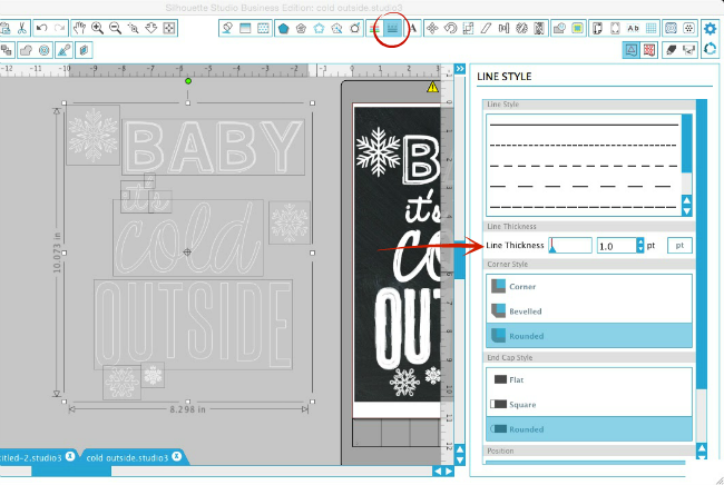
- Select the entire design, give the lines a weight (1.0 is ideal) in the Line Style window (below)
- If you already added the chalkboard background, move it out of the way. It will just annoy you when you continually select it instead of the text. Ask me how I know. (Wondering how to get a chalkboard background? Find a free chalkboard pattern and add it to your patterns folder just like you would add any custom pattern to the My Patterns folder....then use the Fill Patterns tool to fill a blank rectangle in Studio to create the background.)
Select the Sketch Tool along the top tool bar. With the text still selected, pick Charcoal or Pencil. I prefer charcoal because I feel like it's closer to chalk than pencil (not that I've drawn with charcoal).
For some quirky reason the line color
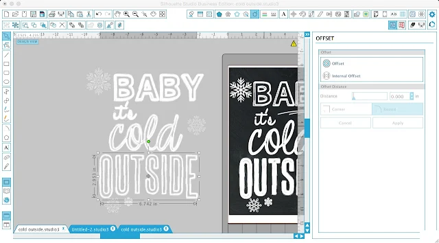
I recommend you zoom in a bit here (circled in green) so you can really see what you're doing. With the word selected, click the Offset tool > Internal offset > Apply.
Don't de-select (or click off), you want to keep the offset you just created selected.
Now repeat the process. With each internal offset you create, the letters will 'fill in' more and more to make them appear solid. If you don't notice much of a difference in the fill, after you click "internal offset", reduce the offset distance. Repeat this internal offset process until the letters are filled in to your liking.

Move to the next text box and go through the same process until you've completed the internal offset routine with all of the text boxes and all of the designs. Keep in mind you don't need to fill in each word or design the exact same way or to the same extent - chalkboard art isn't perfect. It's not meant to be completely uniform that's the charm in it.

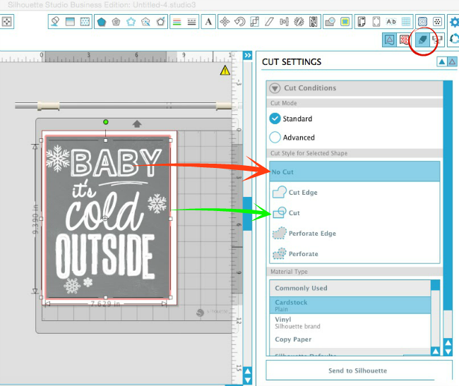
If you're going to print your design for a printable (recommended in this case), select all of the text and from the Cut Settings Window pick "No Cut".
Select the border of the background and turn on the cut line (green arrow)...then add registration marks and proceed like a normal print and cut.
TIP: If you're going to sketch this design - consider this your warning that it will take a LONG time to process and sketch it. In that case, keep the text as "cut" and select the sketch pen further down the Cut Settings list.
Note: This post may contain affiliate links. By clicking on them and purchasing products through my links, I receive a small commission. That's what helps fund Silhouette School so I can keep buying new Silhouette-related products to show you how to get the most out of your machine!
Thanks for coming to class today at Silhouette School. If you like what you see, I'd love for you to pin it!

Get Silhouette School lessons delivered to your email inbox! Select Once Daily or Weekly.








.png)


Hello! Is there a filling pattern you recomend to use? Please send a link. Thank you! Love your blog!
ReplyDeleteLove the look. I am assuming that if you are printing you will be printing the black in the background since you cannot print the white. That is the only draw back from a look I love. Lots of black ink used. Is there a different way? Your blog is terrific.
ReplyDeleteLinda - Could you save your print and take it to Staples or some other printing place & have them print it for your. It is VERY reasonable priced or order place your order on line.
DeleteHow do you get the white to print on the black background? I printed it several times but only the black shows up.
ReplyDeleteI am having the same problem. I only get the imported chalk background. I've changed the text to "no cut" and added the registration marks and still didn't get the text to cut.
DeleteI figured out the problem. The line thickness had defaulted back to 0. I changed the line thickness to 1 and it printed fine.
DeleteThis is really great! Thank you!
ReplyDeleteIs there any way to do this for cutting Oracal 651?
ReplyDeleteWell, amazing. Especially this kind of creation looks great when we write some blog and make this kind of feature image. Thanks. Now i create some useful images for my blogs. http://creativepaperco.com/
ReplyDelete