I briefly touched on this in reference to chalkboard fonts - as seen below - which often have a lot of detail and honestly, for me, are more of a headache than it's worth for a stencil or cut design. Can you imagine weeding all those little dots...and that's if the blade could even cut it without ripping those extremely tiny details.
While these fonts might never be ideal for Silhouette, there are others that can be easily altered to make them more Silhouette-friendly so they produce better stencils, vinyls, transfers or whatever you're cutting.
Let's just use the font Desdemona as an example. The font looks like it would make a great stencil...

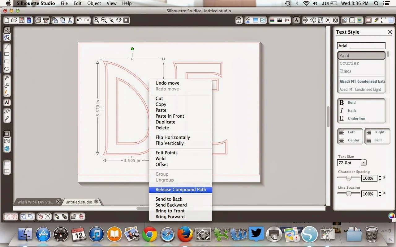
... but a closer look and you can see that each letter is actually a double line. That means when Silhouette cuts it it's actually cutting a very, very thin line that really has no use for a stencil, etc.
To fix this we can get rid of the outline. Do this by ungrouping all the letters first. Highlight word>Right click> Ungroup.
Working with one letter at a time, highlight letter>right click> Release Compound Path. This breaks the letter down even further than the ungroup function can.

Once the compound path is released you can literally pull the two parts of the letter apart. And look now Silhouette will be able to cut a nice easy design that will be easy to week and even easier to transfer or stencil.
I like to use this same method on Dingbat fonts and imported JPEGs that have just a little too much detail. This owl, for example, would create a very thin stencil if left in its original form. See how it's double outlined in most areas?
Now if I ungroup and release the compound path I'm left with this....
Much better! And I'm not even losing anything on the design.
Thanks for coming to class today at Silhouette School. If you like what you see, I'd love for you to pin it!


.png)


I can NOT thank you enough for this post! I am still a newbie and have been trying for HOURS to figure out how to do this before I stubbled upon your detailed explanation. Thank you, Thank you, THANK YOU!!!
ReplyDeleteOh Melissa!!! thank you for this. I have been struggling for an hour trying to get rid of a double line on my letters. this worked perfectly.
ReplyDelete