For more complex word art I have always suggested using Powerpoint or another similar program and then tracing the design in Silhouette Studio. But recently I discovered you can actually make simple word art designs in Silhouette Studio.
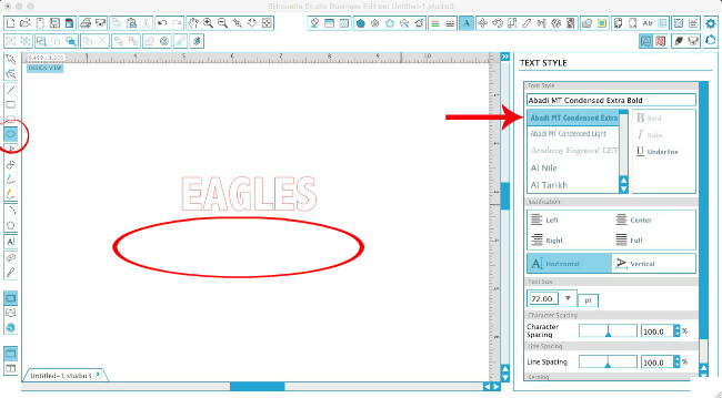
Open up Silhouette Studio and type out your text. This works best with a sans serif font. For this example I'm using Abadi MT Condensed Extra Bold.
Click the Draw an Ellipse tool from the left sidebar and draw out a horizontal oval. The longer the oval the less dramatic your word shape will be so just keep that in mind.
Size the text so the middle of the word - preferably just one or two letters - is sitting on the top of the oval. You can select both the text and the oval and use the Align tool to Align Horizontally - Align Center if you're not an 'eyeball it' type of person.
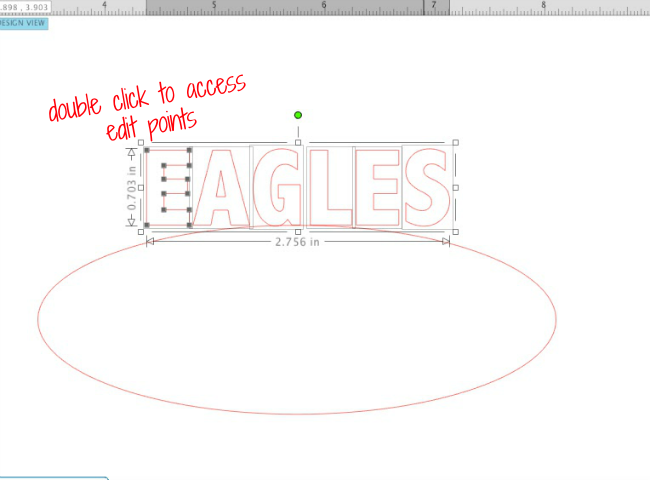
Select the text box and ungroup. Yes, go against all things I've ever told you about text and ungroup it. Ungrouping the text will do three things:
- It will give you access to each letter individually
- It will no longer have Silhouette Studio treat the text as text, but no as a shape
- It will allow you to access the edit points
Depending on what letter it is - you can either drag the letter down or you may need to access the edit points. If the first letter here was an I, I would select the letter and just drag the selection box down to elongate the I...but because it's an E where it has some horizontal elements, I'm going to use the edit points.
The only edit points I'm going to move are those on the bottom. You only need to move them a short distance - just so they're now touch or close to touching, the oval.
Repeat with all of the letters...except the letter that's right in the middle and is already sitting right on top of the oval.
The S is one of those letters where I can select it and drag the box down rather than moving the edit points.
Once all the letters are adjusted to touch the top of the oval you can move the oval away.
You can stop here or you can repeat the same process along the top of the word. You can use the same oval, even.
I want to stress, this is different from Text to Path where you drag the entire word onto the edge of a shape and the entire word curves. What we are doing with this basic word art is keeping the center of the text aligned and adjusting the shape of the top or bottom of each letter to distort it.
Thanks for coming to class today at Silhouette School. If you like what you see, I'd love for you to pin it!

Get Silhouette School lessons delivered to your email inbox! Select Once Daily or Weekly.


.png)


It's still an awful lot of work. I've been messing with the same sort of thing this morning, only I've been trying to make one side of a word higher than the other. Think of a road sign pointing off into the distance. The near letters are going to be larger than the far letters, and they are going to taper as they move away. A whole lot of work for a small payoff and know I have a headache. It's high time Silhouette enabled this function with just a click of a button.
ReplyDeleteI figured out how to do radial gradients as well, but it is a bit time consuming.
DeleteThanks! I love doing word art projects for my friends, but don't like buying them in the Silhouette store. I am going to play with this - -
ReplyDeleteGreat Article I love to read your articles because your writing style is too good, its is very very helpful for all of us and I never get bored while reading your article because it becomes more and more interesting from the starting lines until the end. So Thank you for sharing a COOL Meaningful stuff with us Keep it up..!
ReplyDeleteSAP training in Chennai
Thanks for the great Word Art tips, Melissa. This is perfect for a small project rather than clicking over to a different program.
ReplyDeleteYour articles are always well written, easy to follow, and full of information! thanks so much!
ReplyDeleteThank you Melissa you are awesome. You help so many people with these instructions on this blog, Cheers Anna.
ReplyDeleteGreat! Very good program explanation! The text is written simply and comprehensibly, plus good illustration.
ReplyDeleteVisit site.com
Great!
ReplyDeleteTHANK YOU! You explained this perfectly. Thank you thank you thank you!
ReplyDelete