I'll show you exactly how to use it in a second...
First, though, here's a quick look at some of my favorites goodies in this month's $29 bundle...you know the drill...all the fonts are Sil friendly, all the fonts include commercial licenses, and all the fonts are just too fab not to have!
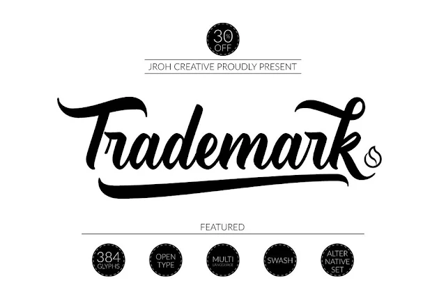
 Now let's talk about my fav among the favorites...Trademark! This font, which I'm calling a 'baseball style font' is one of those that includes a whole bunch of glyphs and extra characters AND it's specially coded so they're all accessible in Silhouette Studio.
I went into a lot of detail on how to use specially-coded fonts with glyphs and extra on either PC or MAC previously, so I'm not going to bog this tutorial down with all the nitty gritty. If you need an in-depth refresher check out how to 1) download and install new fonts into Silhouette Studio and 2) access hidden font characters on MAC here and PC here. Then come on back because this is too cool!
Just like with any new font you want to open in Silhouette Studio, first you need to download and install Trademark onto your computer. The next time you open up Silhouette Studio, it will be in your font list.
Okay once you've done that, open Studio and type out your word - this could be a team name or you child's name or your city...whatever! I just typed my text in the default text.
Once it was sized, I selected 'Trademark' from the font style list to change the font. Now you'll notice the e is the standard e still. I need to grab one of those special glyphs to get the banner below the name.
Use the process explained in the links above to grab the characters from your font book on MAC or your character map on PC.
Copy the character.
Back in Silhouette Studio, click in the text box and delete the letter you want to replace.
Now paste the new letter from your font book/character map.
If you want to add some text in the banner, don't weld yet.
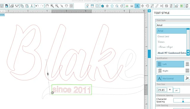
Instead, right click the character you just added with the banner and 'convert to path'. This will allow you to add text inside that banner and have the text take the shape of the banner - as slight as it may be.
In the screen grab below, notice how the e is now gray. That indicates it's now a path (shape) and no longer text.
Start a second text box and type out the text you want in the banner. Pick your font and size it.
Double click to get the green box, then use the directional arrow to pull it into the banner. If you don't want it more in the middle of the banner use the slider bar to pull the text up.
When you get it where you want it, convert the text to path > right click > convert to path. This will keep it in it's shape.
Now select the large text and you can weld it together so it cuts as a solid piece. If you're cutting on HTV, flip that bad boy and cut!
Weed the vinyl, including the letters in the banner, and you're all set to iron or press your HTV decal onto a shirt.
I went with a baseball style raglan shirt as a play on the font..and I love the way it turned out!
While I made this one for my little man, since Trademark and all the fonts that come in the Fontabulous Font Bundle come with the commercial license, you can legally sell items you make using this font! Ohhhh the possibilities!
Note: This post may contain affiliate links. By clicking on them and purchasing products through my links, I receive a small commission. That's what helps fund Silhouette School so I can keep buying new Silhouette-related products to show you how to get the most out of your machine!
Thanks for coming to class today at Silhouette School. If you like what you see, I'd love for you to pin it!

Get Silhouette School lessons delivered to your email inbox! Select Once Daily or Weekly.


.png)


Can anyone tell me whether you can have too many fonts on your computer? I seem to recall hearing this. I'm still trying to get October's bundle downloaded and it takes soooo long. But I'm afraid I will run out of computer space with all of these fonts I keep getting. Thanks.
ReplyDeleteA factor that distinguishes one group from another is their football group company logo. These signs are designed with cautious thought and information so that it shows the crew's character and originality and will set it apart from their competitors.
ReplyDeleteIf you think that you just have to open a lounge for it to be popular then you are wrong. Proper branding is essential if you want a competitive edge over others.
ReplyDeletenice style
ReplyDeleteIt is necessary to evaluate your group so you can do what you need to do to get hold of the silver. But what is a affordable factor deficit?
ReplyDeletei have a mac and when i try to drag and drop it doesnt work and won't work by copying and pasting either?
ReplyDeletenice post
ReplyDeleteBaseball style font is very stylish font. Thanks for share your exclusive path.
ReplyDeleteBegin a second content box and sort out the content you need in the standard. Pick your textual style and size it.
ReplyDeleteDouble tap to get the green box, then utilize the directional bolt to maneuver it into the flag. In the event that you don't need it more amidst the standard utilize the slider bar to pull the content up.