Today's is perhaps one of the most important lessons I've ever shared on Silhouette School...I'm not even exaggerating. Today I'm going to give you some tips on creating your own designs in Silhouette Studio.
Now why would you want to do this when you can just buy a design from the Design Store for .99 or trace a shape you find on the good 'ol www? The biggest reason is that if you want to sell something with a design on it (or the design itself as a decal) you need to have a commercial license for it and that costs money. But if you create your own designs they're YOURS and you're free to use them however you want.
Now I'm not saying you need to go out and create every single design, but honestly and truly there are so many that you can make your self in Silhouette Studio by simply combining a few - or one - basic shapes. I should also mention I'm not a graphic designer. I was a news producer by trade before I started this whole mom blogger gig thing... so don't go thinking I have anything up on ya!
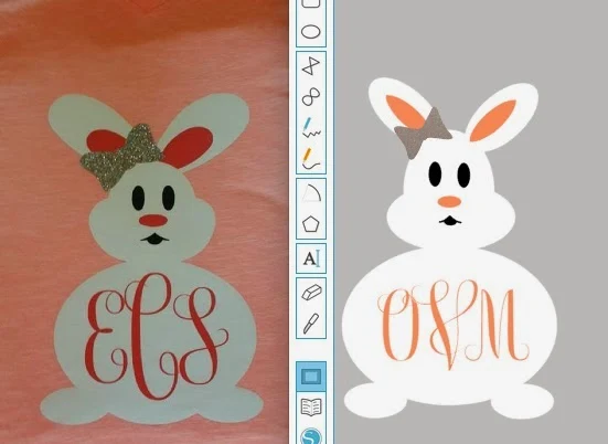
Let's look at this bunny. It's actually the design that got me thinking about why people don't create their own designs. A reader asked me where to find the design on the left and I honestly had no idea..I don't shop the Design Store too often. But looking at it in its most basic form, it just looked like a bunch of ovals. Sure enough...within just a few minutes I had myself an almost identical bunny as you can see on the right.
The first thing I suggest you do when you want to create a design is find some inspiration. In this case, obviously, it's the original bunny....further down in the post you'll see how I used an actual photo to create a design. Once you have your inspiration, look at it as smaller pieces, not one big shape.
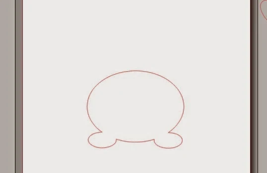
So for the bunny, let's start with the body. By simply using the Draw an Ellipse (in blue along the left sidebar) tool you can create an oval shape. The feet are simple enough - just add two smaller ovals and move them into place.
You can weld as you go if it's easier for you to "see" the final shape that way or you can do the full design and then weld it all together. Welding forms more than one shape into a single solid shape with a single cut line. To weld, select all of the shapes to be welded together and right click > weld.
Now take a look at the head basic shape of the head in the original...by overlapping two ovals, one horizontally and one vertically, you can easily get the shape of the head.
If you find it difficult to really "see" the actual shape of the design because of all the crossing lines, fill in the designs with a solid color and change the line color to transparent. You can see here that the head looks much more like a head with pudgy cheeks when it's filled in with brown.
Lastly, add the ears...again as long ovals. Before you weld the ears to the rest of the head create an internal offset to get the inner ear. Then drag them away so you can place them back in the design later. If you try to weld the design together with the internal offset on there, they will disappear.
So now you should have something like the image on the left and when you weld it all together you'll be left with the image on the right!
Now pull the inner ears back into place and draw out three more ovals for the eyes and nose. Again, fill them with color as you go! I promise it's so much easier to design in color!
Let's start with the bow. To create the bow....look at the original closely. It's basically two triangles welded with a circle in the middle. Use the draw a polygon tool to draw a polygon on the left sidebar and adjust the sides down to 3.
Mirror it so you get another identical triangle and then draw an oval or circle and place it in the center of the two overlapping triangles. Weld the three shapes together and BAM you have a basic bow shape.
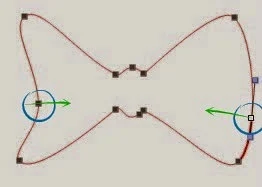
The loops are a little too squared off for my taste (#1) so to give them more of a rounded look we need to adjust the edit points.
Double click the design and the edit points will be revealed (#2). To get to #3 use the mouse (and hold down shift) to click on the edit points you want curved. The selected edit points will turn white (#2).
From the edit points window, click Make Curve and it will result in #3. Repeat on the other side to get to #4.
Now if you want the sides of the bow slightly in a little bit, like the original design we are getting inspiration from, you need to click the edit points again and create two new new edit points (circled) then pull it in toward the center.
Pull the oval into place (#2) and weld all three shapes together (#3). Select the shape > right click > release the compound path so you can delete that unwanted triangle (circled area in #3) and you're left with #4 when you fill in the shape with color.
Now put your bunny shapes all together and fill them in with color and change the line color to transparent and you've created your own shape!
Here are a few more designs I've created from scratch just using basic design shapes...
For these exercising guys I looked at the shapes of actual people (errr...my handsome Mr) in the positions and then used a combination of rectangles and circles to create the "stick figure"-inspired exercisers.
The key to designing in Silhouette Studio is looking at images in a different way - look at them in their most minimal form and get creative with the basic shapes in Silhouette Studio and the possibilities to create your own designs are endless.
For more on techniques found in this tutorial, refer to the following pages in
The Ultimate Silhouette Guide:
Page 14 - Tool Bar Labels & Descriptions
Page 18 - Welding vs. Grouping
Page 26 - Offset
Page 33 - Edit Points
Page 44 - Line Color/Fill Color
Note: This post may contain affiliate links. By clicking on them and purchasing products through my links, I receive a small commission. That's what helps fund Silhouette School so I can keep buying new Silhouette-related products to show you how to get the most out of your machine! Page 18 - Welding vs. Grouping
Page 26 - Offset
Page 33 - Edit Points
Page 44 - Line Color/Fill Color
Thanks for coming to class today at Silhouette School. If you like what you see, I'd love for you to pin it!










.png)


Another way to create original designs if you're artsy is to draw something with a marker, scan it, and trace it, then adjust points.
ReplyDeleteSee my tutorial here
Love the crossfit guys!
ReplyDeleteMelissa, Oh Melissa! I have been a subscriber for not very long and all of your tutorials have been so beneficial, but this one OMG. You have opened my eyes to so many more possibilities. Thank you so much and greatly appreciated!
ReplyDeleteExcellent this post set aside some an opportunity to peruse through a couple of sites and see what they bring to the table you visit http://scantoolcenter.com/blog/best-obd2-bluetooth-scanners/
ReplyDeleteNice Blog and also very helpful for beginners.
ReplyDeleteIt just occurred to me while reading this that the scrolls and curves I'm having so much trouble learning to do in Studio could start as circlesand ovals...hmmmm. Thank you!
ReplyDeleteI followed the tutorial down to the end. It was wonderful and I learned a lot. However, I have a problem with the bunny mouth. I did the oval, the arc with offset, mirrored the arc and welded to oval. But, now, I cannot remove the triangle. In fact, when I right click on the mouth shape, release compound path is not an option. I have selected the mouth and clicked on Release Compound Path under the Object Menu. It does not appear to have any effect even after I repeatedly clicked on Release. What am I doing wrong.?
ReplyDeleteI'm trying to Pin this article and it keeps saying that this article has spam? Any help on saving this article?
ReplyDeleteLove this article. I try to explain the same concept but sometimes it is hard for someone who is not graphically inclined to visualize. Was looking for some good backlinks for my next tutorial and this one just made the list. Appreciate all you do!
ReplyDelete