Let's get started by opening up Silhouette Studio.
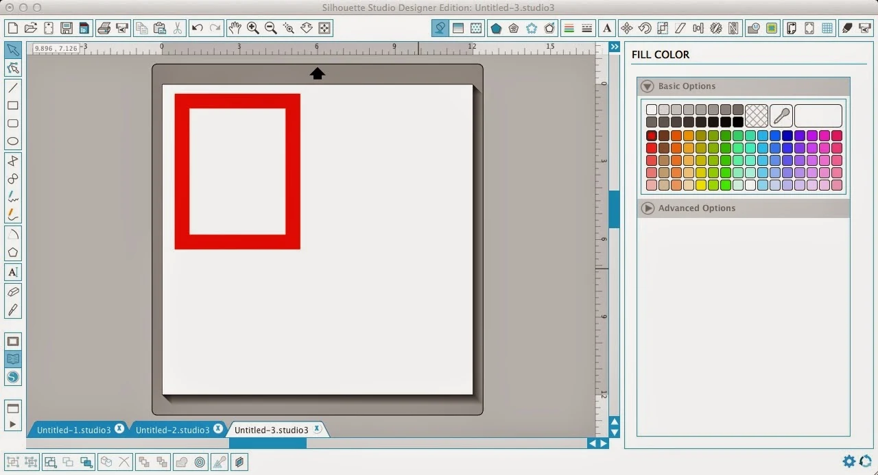
Use the draw a box tool on the left sidebar to draw a box in the work area. Draw it whatever size you'd like...you can always resize later.

Now select the box and click on the offset tool (in blue along the top below). You can either make an offset or an internal offset it doesn't really matter. I like squared off frames so I picked 'corner' and then adjusted the offset distance..then hit 'apply.'

Right now you basically just have a box on top of a larger box. The easiest way for me to show you this is by filling in the boxes (and slightly moving the top box for demonstration purposes only!) These boxes are NOT a compound path...therefore they are not a frame. They are just layered boxes.
But if I select both of the boxes at the same time and then make a compound path (right click > make compound path) they become a frame (with a hollowed out middle area).
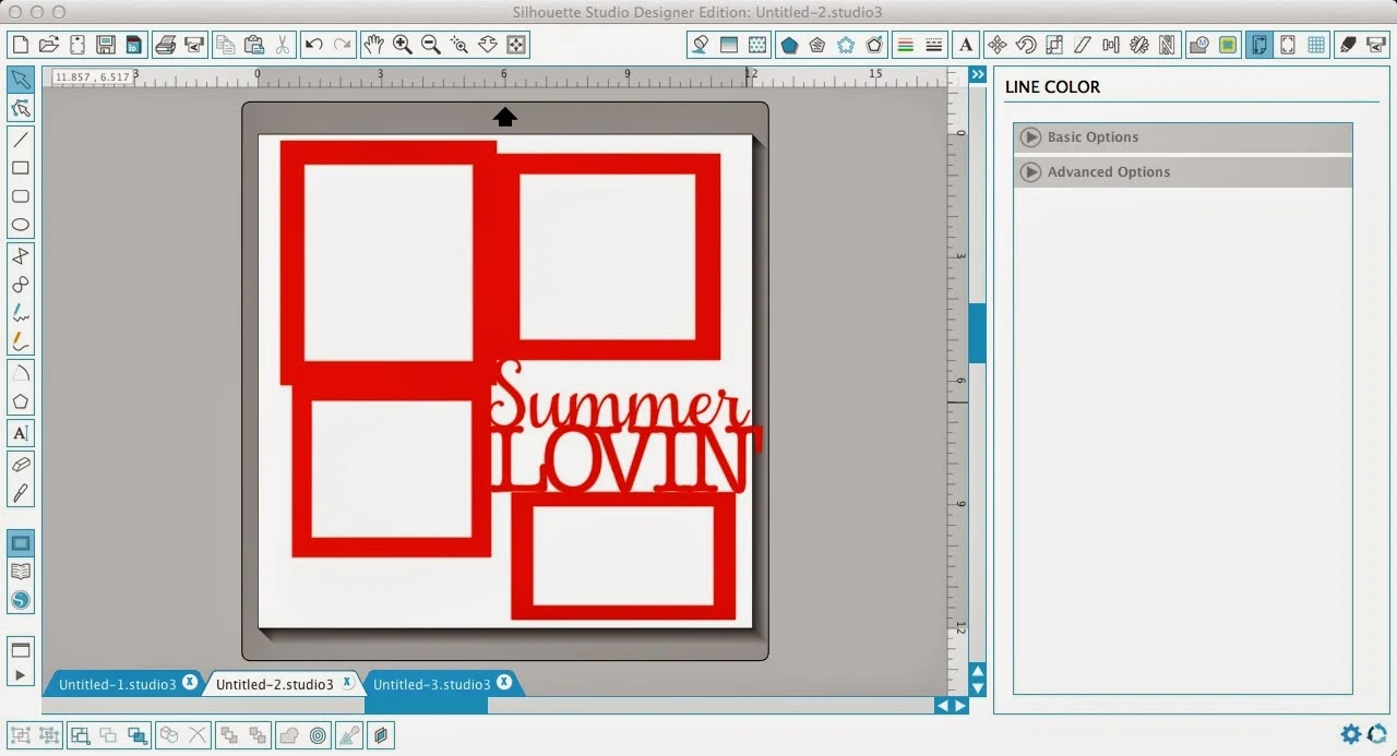
Once they've become a compound path I can weld into the boxes or weld several boxes together. That's exactly what I want to do to make this frame layout. Now that I've made the first box I can duplicate it a few times by copying and pasting. Then I just resized each of the frames and put them into position. Don't weld yet...

Add your text. Whenever possible I like to have my text welded together. Now there are a few ways to get around this if you have letters like the S and 'ummer' where it's cutting as two pieces.
For instance, I moved the characters closer together in "LOVIN'. Since they will now cut as one word, I just made sure they would weld to both the side and bottom frames and the 'ummer' and that allows my entire design to cut as one piece once welded.
To weld I simple select the entire design > right click > weld.
When I fill this with color again it's easy to see that the entire design has a single cut line around it. If it didn't, the area that was not welded would not fill in.
Finally, I do just want to show you what would happen if I had NOT made the frames a compound paths before welding them together and with the text. See the problem?! And see why compound paths aren't just there to confuse you..they actually do serve a purpose. :)
Note: This post may contain affiliate links. By clicking on them and purchasing products through my links, I receive a small commission. That's what helps fund Silhouette School so I can keep buying new Silhouette-related products to show you how to get the most out of your machine!
Thanks for coming to class today at Silhouette School. If you like what you see, I'd love for you to pin it!


.png)


Nice tutorial! Thank You
ReplyDeleteThe free online grammar and punctuation corrector are here. This enhance your confidence in grammar to prove yourself.
ReplyDeletewow! That is a great lesson. Thank you!
ReplyDelete