If you sell items you make with your Silhouette you may want to make mockups so you don't have to physically create an example of every single option - be it color, phrasing, size, personalization - you offer. Today I'm going to show you a pretty simple way to create mockups in Silhouette Studio.
I'm going to use these sports ribbon holders as an example. The great thing about these is that they can be personalized pretty much anyway the buyer could possibly want. That leaves a lot of options and for those who just need to 'see' it...mock ups are the perfect way to offer a preview before you go through the whole process.
Alright so the first thing I'm going to do is paint a few of my plaques in different colors. I had orders for these three colors so it worked out perfectly. And as you get new orders you can add new mockups. After the paint was dry, but before I added the personalization, I took photos of each of the plaques on a white background. The key is to have good lighting and a good straight on shot. It also helps to have a high quality camera so the resolution is nice and crisp.
Save all the photos to your desktop or some place that they'll be easy to drag and drop into Studio.
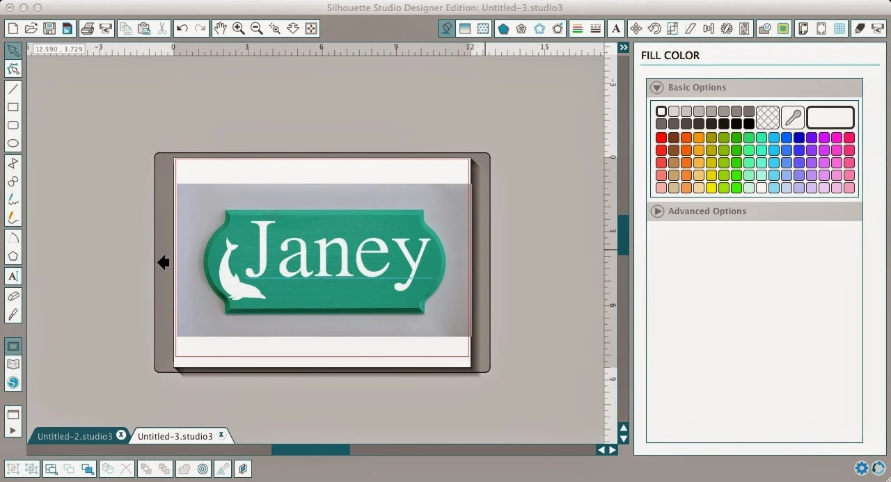
Open up Studio and drag and drop your first photo right into the work area. (For a step by step tutorial on bringing jpegs/gifs/pngs into Studio read this tutorial.) Re-size it.
Now it's time make it personal. I have people who order these for swim ribbons and others who don't need the hooks, but want a name plaque and others who can't decide where they want a special design or aren't sure of colors...so this is where the options come in.
Use the text tool to type out your wording. Fill in the font with whatever color they 'think' they want the lettering to be and change the line color to the same color.
NOTE: To turn off Spell Check so you don't get that annoying line under the name in your mockups... Select the name > Right Click > Add 'WORD' to Dictionary.
When you're ready, move all of the text and any design details and drag them over the photo. Now you can take a screen grab (on my Mac I use the program 'Grab') to share with your customers or use these images to add to your Etsy shop or website without making every single option you offer.
So above is the mockup I sent my client (it's a good idea to add a watermark so your work can't simply be copied)...and below is the finished product! As you can see this was a great way for my client to see what they thought they wanted..and then make changes to what they really wanted without me doing any extra work.
Thanks for coming to class today at Silhouette School. If you like what you see, I'd love for you to pin it!


.JPG)


.png)


This comment has been removed by the author.
ReplyDeleteThank you so much! I was desperately needing to figure this out!
ReplyDeleteWhat a brilliant idea. I can see me adding this to my want to make ideas.
ReplyDeleteThis is SO helpful! Thank you for this post!
ReplyDeleteOh wow! Thanks for this awesome pic! What I've been doing is making the design then taking a screen shot. THEN, I move the screen shot from desk top into iPhoto, crop it tightly around the white area so there's a thin grey background border. Then I text or email the photo. I will certainly be trying this MUCH better looking way! I just need to make some blank signs which will be easy! Thank you for sharing so much of your knowledge!
ReplyDeleteThank you Melissa, for the great tip on Mock-Ups, this will certainly save money ;-)
ReplyDeletei checked out pickmonkey. looks like a neat program but the free is only good for 30 days.
ReplyDeletei have a PC (not a mac), how do i get a screen shot or save a picture of the mock up to be able to use the picture? I'm sorry, i can't figure it out.
ReplyDeleteThanks!
Use the PrntScr (print screen) button then paste in another location and crop.
Delete