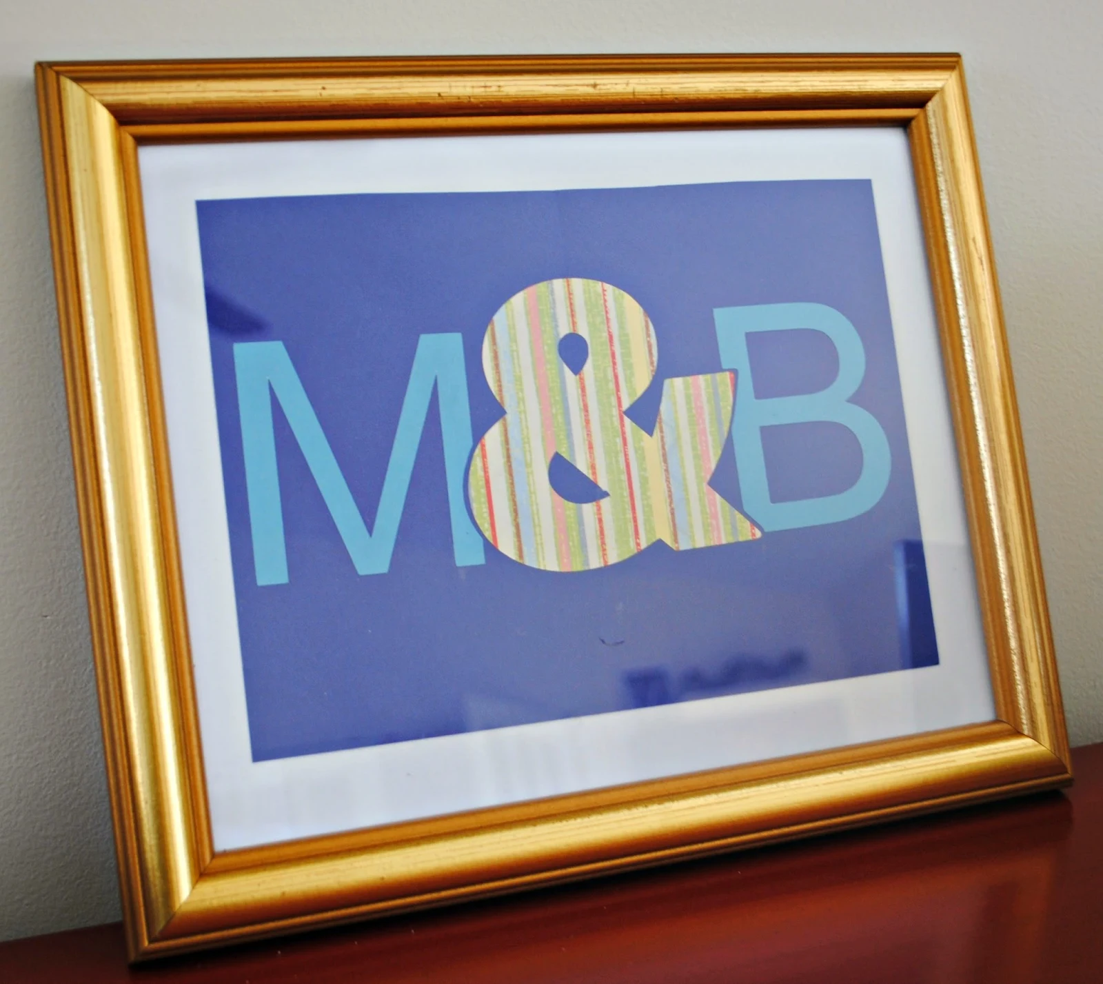
The subtract tool lets you cut out or subtract sections of designs so they perfectly align with other designs. In this example, a portion of the M and B are subtracted around the ampersand.
The secret to the subtract tool is layers. Depending on which layer of your design is in the foreground and which is in the background will determine what piece is 'subtracted.'
For this example, since I wanted M and B to have subtracted areas, I made sure the '&' was 'in front.'
Okay let's get started.
Open Silhouette Studio and head to the Design area.
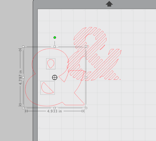
I used an ampersand design I had in my Silhouette Studio library. I ungrouped and released the compound path to delete all the diagonal lines.
Once the ampersand was ready in Silhouette Studio, I added my M and B. I typed them each separately so I could position them freely without them being grouped.
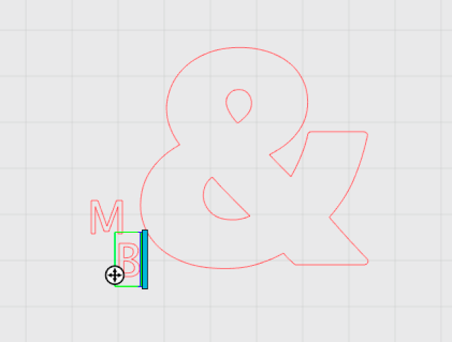
I resized the letters and then overlapped them with the ampersand so it looked like this.
Now it's time to start subtracting. Open the Modify panel from the right tool bar.
Select the entire design at once and click 'Subtract All'. You must highlight/select the foreground image and the background image at the same time for the subtract all or subtract tools to work.
It will look like nothing happened...
...but if you move the designs apart you can see the area of the M that was covered by the ampersand has been subtracted.
I cut the letters on one paper and the ampersand on a coordinating paper and then mounted them on another complimentary color to really make them pop. I think this would be cute in a bedroom shared by siblings or for twins. If you use more romantic or subtle paper it would even work for a master bedroom or as stationary. There are so many possibilities.
Here's a closer view at the subtracted area and how it comes together.
Now if you're wondering what the difference is between 'Subtract' and 'Subtract All' this is how the Silhouette manual describes each:
Subtract: This option will remove all overlapping parts of images that are in front of
other images, so that only the image located in back will remain with the overlapping
parts removed.
Subtract All: This option will remove any portion of an image that is in back behind another image
I find a graphic more easy to understand so here's one I created to show the effect you get on a single design depending on what's in the foreground and background and whether you use the 'subtract' or 'subtract all' tool. Note: The top images included two circles originally, but one of the circles is no longer visible after using the subtract tool.


.png)


For this example, since I wanted M and B to have subtracted areas, I made sure the '&' was 'in front.' vinyl cut lettering online
ReplyDeleteGreat tip! Especially the front vs back positioning. Thanks :)
ReplyDeleteTHANK YOU!! This has been one issue I've been struggling with for awhile. And, as always, I appreciate your visual examples!
ReplyDeleteThis comment has been removed by the author.
ReplyDeleteSo my sister and I have been trying to make a scalloped type background. We took multiple sized circles, grouped them together and then layered them on top of each other. We didn't want all the cut lines under the area that was below another set of circles so we used the subract all. It is fine if we only do two or three sets, but once we hit the fourth or fifth then the program locks up. We have used a Mac and a PC and it does it on both. Any suggestions?
ReplyDeleteI have the same problem. I hate how glitchy this program is!
Deleteso this still has to be cut as two different designs and layered right?
ReplyDeleteIs there a keyboard shortcut for subtract like there is for Weld?
ReplyDeleteMelissa, GOOD GRIEF! Thank you, I do this so often in designs from the Studio Design Store to one I make myself. But I have always used the knife tool the had to delete the unwanted lines and reconnecting lines that had to be attached. This took me a LONG time. This is fantastic! I had no idea. So thank you!! You are the greatest!
ReplyDelete